Monday, September 28, 2009


Google Blog Updates (Google Docs, Gmail, Blogger, Search)

View online files using the Google Docs Viewer

Posted: 26 Sep 2009 07:03 AM PDT

Google Docs Viewer allows you to view certain files online. Enter the URL of a PDF, Powerpoint or TIFF document in the Viewer and we'll display it directly in the browser with no download required.

Editions included:
Standard, Premier, Education, Team and Partner Editions

Languages included:
US English

How to access what's new:
Visit the Google Docs Viewer to generate the URL.

For more information:
http://googledocs.blogspot.com/2009/09/view-online-files-using-google-docs.html

---------------------------

Jump to the information you want right from the search snippets

Posted: 25 Sep 2009 12:30 PM PDT

For most search results, Google shows you a few lines of text to give you an idea of what the page is about — we call this a "search snippet." Recently, we've enhanced the search snippet with two new features that make it easier to find information buried deep within a page.

Normally, a search snippet shows how a page, as a whole, relates to a your query by excerpting content that appears near and around where your query terms show on the page. But what if only one section of the page is relevant to your search?

For more information:

---------------------------

New in Labs: Hide read labels

Posted: 25 Sep 2009 08:18 AM PDT

Posted by David de Kloet, Software Engineer

A lot of people want to see their labels in order to see which ones have unread messages, but they don't want a long list of label names cluttering up the left hand side of their inboxes. To help out with this, we've made a Gmail Labs feature called "Hide read labels." Turn it on from the Labs tab under Settings and all your labels without unread messages will be hidden under the "More" menu. Labels with unread messages will automatically show up, unless you've explicitly chosen to keep them hidden.

For more information:

---------------------------

Blogger's Wanted

Have opinions about Blogger? If so, we'd like to meet you. We are looking for participants willing to document their blogging practices over a few weeks and answer some interview questions. This will help us better understand your needs and keep improving Blogger.

Interested? Sign up here.

For more information:

Friday, September 25, 2009


New in Gmail Labs : Hide Read Labels

http://3.bp.blogspot.com/_JE4qNpFW6Yk/Srze5bvDLqI/AAAAAAAAAZ8/Iq1v8mOGfn4/hide_unread_labels.png

A lot of people want to see their labels in order to see which ones have unread messages, but they don't want a long list of label names cluttering up the left hand side of their inboxes. To help out with this, we've made a Gmail Labs feature called "Hide read labels." Turn it on from the Labs tab under Settings and all your labels without unread messages will be hidden under the "More" menu. Labels with unread messages will automatically show up, unless you've explicitly chosen to keep them hidden.

[hide-read-lables.jpg]


This is particularly handy if you use your inbox as a to-do list where unread messages are the outstanding things you need to take care of. If you use that method along with labels like "Home" and "Project X," it's easy to see all your to-dos in context. With this Labs feature on, labels with outstanding to-dos will be bold and have a number next to them; everything else will be hidden in the "11 more" section:

We think this is a nice addition to the new labels navigation bar and hope you like it. Tell us what you think in the Gmail Labs forum.

Original source : http://gmailblog.blogspot.com/2009/09/new-in-labs-hide-read-labels.html
Related Link : http://gmailblog.blogspot.com/2009/07/labels-drag-and-drop-hiding-and-more.html
Gmail Blog : http://gmailblog.blogspot.com/

Wednesday, September 23, 2009


Google Blog Updates [Including Gmail]

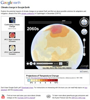
Google climate change tools for COP15

In December of this year, representatives from nations around the globe will gather in Copenhagen to discuss a global agreement on climate change. The objective is to reduce global warming emissions sufficiently in order to avoid the most severe impacts of climate change and to support the global community in adapting to the unavoidable changes ahead. Denmark will act as host for this fifteenth Conference of the Parties under the United Nations' Climate Change Convention, known as COP15.

https://blogger.googleusercontent.com/img/b/R29vZ2xl/AVvXsEgeWNwZHGhZKRUHrRrnSEWfe-yziu74tA-aL-n1FvLKICL2caR2Z_4eqNfNF7d_Iu8ajVUeR1BRlEgoOBDm_XJ6yz_2AmzgBDTvES1LFJCAc7uBY76IyBvnrWtgenNCxxGQIJ72uMATIqzm/s320/cop15geo_blog_post1.jpg

In collaboration with the Danish government and others, we are launching a series of Google Earth layers and tours to allow you to explore the potential impacts of climate change on our planet and the solutions for managing it. Working with data from the Intergovernmental Panel on Climate Change (IPCC), we show on Google Earth the range of expected temperature and precipitation changes under different global emissions scenarios that could occur throughout the century. Today we are unveiling our first climate tour on Google Earth: "Confronting Climate Change," with narration by Al Gore. Stay tuned for more tours in the coming weeks!

Read More : http://googleblog.blogspot.com/2009/09/google-climate-change-tools-for-cop15.html


Push Gmail for iPhone and Windows Mobile


Those of you who live in your Gmail inboxes usually want to know what's happening with your email more instantly than standard fetch mail on your phone allows. Sure, using Gmail in your mobile browser gives you all the benefits of conversation threading and starring, but you still have to refresh every time you want to check for new mail.

When we launched Google Sync for Contacts and Google Calendar earlier this year, an over-the-air, always-on connection to sync mail was noticeably absent. We heard your requests loud and clear, and starting today you can use Google Sync to get your Gmail messages pushed directly to your iPhone, iPod Touch, or Windows Mobile device.

You can set up push Gmail by itself or choose to sync your Contacts and/or Calendar as well. If you're using an iPhone, make sure you're running iPhone OS version 3.0 or above (on your device, click Settings > General > About and scroll down until you see Version). If your software is out of date, follow Apple's upgrade instructions. Then, visit m.google.com/sync from your computer for set up instructions. If you're already using Google Sync, you can just enable push mail.

Read More : http://gmailblog.blogspot.com/2009/09/push-gmail-for-iphone-and-windows.html

Tuesday, September 22, 2009


New in Gmail : Push Gmail for iPhone and Windows Mobile

Those of you who live in your Gmail inboxes usually want to know what's happening with your email more instantly than standard fetch mail on your phone allows. Sure, using Gmail in your mobile browser gives you all the benefits of conversation threading and starring, but you still have to refresh every time you want to check for new mail.

When we launched Google Sync for Contacts and Google Calendar earlier this year, an over-the-air, always-on connection to sync mail was noticeably absent. We heard your requests loud and clear, and starting today you can use Google Sync to get your Gmail messages pushed directly to your iPhone, iPod Touch, or Windows Mobile device.

You can set up push Gmail by itself or choose to sync your Contacts and/or Calendar as well. If you're using an iPhone, make sure you're running iPhone OS version 3.0 or above (on your device, click Settings > General > About and scroll down until you see Version). If your software is out of date, follow Apple's upgrade instructions. Then, visit m.google.com/sync from your computer for set up instructions. If you're already using Google Sync, you can just enable push mail.

Once you're set up, new messages are normally pushed to your phone within seconds. While this type of speed is pretty awesome, push connections tend to use more power than fetching at intervals, so don't be surprised if your battery life isn't quite what it used to be. We've done a lot of work to optimize power usage, but if you prefer to save battery life, you can always turn off push in your phone's settings and fetch mail every 30 or 60 minutes instead.


A mysterious series for H.G. Wells - Google Blog Update

You might have noticed an unexplained set of doodles on the Google homepage and a couple tweets from our official Twitter stream, @google, over the last two weeks. On September 5th, we posted a doodle with the abduction of our second 'o' and a coded tweet from its alien captors: 1.12.12 25.15.21.18 15 1.18.5 2.5.12.15.14.7 20.15 21.19, which translates into "All your O are belong to us" (a nod to the Japanese video game, Zero Wing).


We were delighted that people around the world played along with us and shared their theories for why we would have posted this "unexplained phenomenon."

Ten days later, the UFO returned. This time, it was to leave its mysterious mark on the fields.


While the link from the doodle to a search for "crop circles" didn't provide any more clues, we also tweeted the lat/long coordinates of Horsell Commons, the location of the first alien landing in H.G. Wells 1898 classic, The War of the Worlds. Some of you figured out what we were doing, but we weren't ready to reveal it all just yet.

Now, we're finally acknowledging the reason for the doodles with an official nod to Herbert George, who would be 143 years old today. 


Inspiration for innovation in technology and design can come from lots of places; we wanted to celebrate H.G. Wells as an author who encouraged fantastical thinking about what is possible, on this planet and beyond. And maybe have some fun while we were doing it.

The invasion of the logo by alien crafts and pods makes our series complete, but you'll have to read the book to find out how Wells' story really ends.


Saturday, September 19, 2009


Celebration of Google Chrome : Google chrome after one year

At Google Chrome's first birthday just two weeks ago, we looked forward to an action-packed year for the browser and the web. Thanks to a full year of great feedback from our users, we're kicking off our second year of Google Chrome with a brand new stable release. This release comes hot on the heels of 51 developer, 21 beta and 15 stable updates and 3,505 bugfixes in the past year.

For you, that means significant speed improvements for the browser as well as a fresh redesign of some of its most loved features. To walk through the top highlights in the spirit of a September of epic sporting tournaments, here's a play-by-play comparison of our brand new release against our previous releases.

A wicked serve, volley, and return: Fast, fast and fast

This new release of Google Chrome is faster than ever, as we continue to provide a modern browser that starts up quickly from your desktop, and is fast to load web pages and web applications.

Notably, we've improved by more than 150% in Javascript performance since our very first beta, and by more than 25% since the most recent stable release.
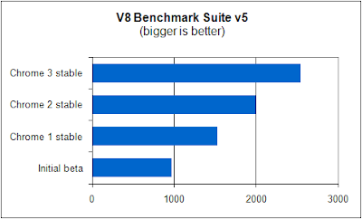
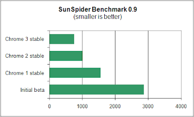

The V8 and SunSpider benchmarks measure Javascript performance for browsers

Your playbook for the web: The New Tab page

When you download and fire up this latest release of Google Chrome, you'll notice that the New Tab page sports a new look:
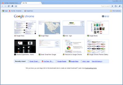

The redesigned, new New Tab page
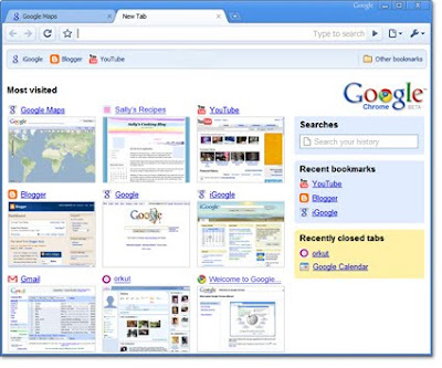
The old New Tab page, which we're now retiring

We've redesigned the New Tab page so that it's easy to use and easily customizable, following some rigorous testing on the most recent beta channel release. Now you can rearrange thumbnails of your most-visited websites by simply clicking and dragging your mouse. Additionally, you can pin thumbnails to a spot so they don't disappear even if your browsing habits change. This way, you can easily get to the websites you care about with just one click.

You can do even more to customize your New Tab page — for example, you can hide parts of the page you don't want to see, or even opt for a simple list view of all your most visited websites. In addition, we've added handy tips to the bottom of the New Tab page to help you get the most out of Google Chrome.

As we bid adieu to the old, New Tab page, let us know what you think about the redesigned New Tab page — we'd love to hear your feedback.

With just a few deft strokes: The Omnibox

We've also improved one of the most used and loved features of Google Chrome, the Omnibox. Because it's a search bar as well as the web address bar, the multi-talented Omnibox helps you get to the sites you're looking for with just a few keystrokes. With this release, we've optimized the presentation of the drop-down menu and added little icons to help you distinguish between suggested sites, searches, bookmarks, and sites from your browsing history.
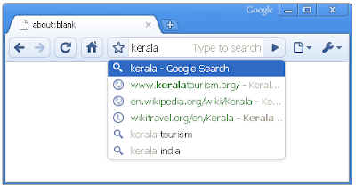
The new Omnibox drop-down menu

Bringing the cutting edge to the field: HTML5 capabilities

We're very excited about HTML5 becoming standard in modern browsers, and continued to add HTML5 capabilities to this stable release. We're particularly excited about the <video> tag in HTML5, which makes embedding videos in a page as simple as embedding regular images. The <video> tag also allows video playback without a plug-in.

You can give the <video> tag a whirl in Google Chrome and also check out our 50th Chrome Experiment, which uses HTML5 <audio> and <canvas> tags. It's great to see the great innovations that come from the use of open standards, and we'll continue to bring the latest and greatest in web technologies quickly to users through Google Chrome.

And finally, a photo finish with style: Deck your browser with Themes

After testing out Themes for Google Chrome in the beta channel, we're finally releasing it in this stable release. Themes allow you to deck out your browser with colors, patterns and images. We'll be bringing more Themes for the browser soon, but in the meantime, you can change the theme of your browser by visiting the Themes Gallery.
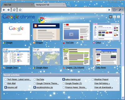
Theme preview: Star Gazing

If you haven't tried Google Chrome recently, we invite you to download and browse the web with this new stable release. Many of the improvements in this release were inspired by the responses from users, so we're all ears if you have any feedback. If you're already using Google Chrome, you'll be automatically updated to this new version soon, but if you're itching to try this right away, download the latest version at google.com/chrome.


Download Chrome : http://www.google.com/chrome
Source : http://googleblog.blogspot.com/2009/09/google-chrome-after-year-sporting-new.html

Friday, September 18, 2009


The Story of New Google WAVE Logo (From logoblink.com)

Google "wave" is a new "collaboration tool" that you and me gonna use soon. This post is about the logo of this new product. I'll try to cover the basics – what kind of logo it is, why it's designed like this, what are the similarities and the differences in compare of other logos. Also you'll find a small collection of graphic situations and interpretation of this new logo. Or just click on the picture to download the logo in vector format.


It looks nice at first sight. A cool 3D logo with gradients and a shadow bellow. As the main shape is floating freely in the air. A feeling of a new technology. Something extraordinaire. Somebody could take it for a new game console logo, but we know what it is.
No logotype. They're using only a mark. As it is in "Chrome". The color pattern is also the same – 4 colors – blue, red, yellow and green.


One should admit "wave" is a nice naming. Many associations are available, but what kind of wave is the logo ? I think it's a "sine wave". The sine wave or sinusoid is a function that occurs often in mathematics, music, physics, signal processing, audition, electrical engineering, and many other fields. Again, like "google", we have a mathematical meaning. More in wiki.
May be they've designed it on purpose, may be not, but there's a curious fact about the line of the logo. If you are interested in feng shui signature rules you can read :
"For success and prosperity, it is best to start with an ascending stroke with the letters rising upwards as you sign and also end with an upward stroke. This signifies a good beginning and a good ending to every project undertaken in future. Signatures ending in downward strokes do not ensure happy endings. Straight-line signatures usually go unnoticed. They are considered neither auspicious nor inauspicious. This can be strengthened by adding a firm line underneath that goes upwards."


The product is not available for the masses yet, but there are a few different usages of the logo here and there. All the following logo variations of the WAVE are officially used by google at this point. I think the avatar with the tilted logo is a good idea (after all the main disadvantage of the mark is that it doesn't look good in small scale, so the problem should be solved in a way ). Google wave is also loosing points when presented in background, different from the black and white. As you can see on the picture with the t-shirt ( a screenshot from the WAVE presentation ) – the usage of all basic colors doesn't leave many options for the background. Blue is a logical desicion for a backup, because it's just a small part of the logo. Although… white is best.

Also I like very much the favicon. Hope they will not change it soon for a reason.[google-logos.jpg]
t's always good to know the other logos in the brand family. I've tried to pick enough examples for you to have a decent point for comparison. A simple conclusion is that the new mark is a sign of a new hope. Services like Adsense and Adwords do NOT have their own mark or logotype. They are just a part of the family…, but Google Wave is born to be different. The usage of just a mark is even a haughty in a way. As we should know that it is "google wave". After all it took NIKE a lot of years to remove the logotype from the swoosh. Look at "bing" – another web star that was born last few weeks – a simple logotype, not pretentious in any way. But Google is big and famous enough to afford it. I guess we can conclude that Google Wave logo is designed in a nice way and it's actually one of the best Google logos, that we know.[google-wave-logo-usages.jpg]
Yes, "wave" symbol is often met in other logo designs, especially in water sports ( O'neill & Billabong ). Coca Cola also use it. Although it's not a part of the official logo, Coca Cola always have used the wave in their identity. It's just working. The wave is a symbol of joy, change, movement ( etc. ) and it looks nice. In my opinion Sony's VAIO logotype ( or mark ? :) ) is the best example of the modern technical logos. Abstract enough.. and yet readable for the targeted consumers. I like VAIO for another reason – with it's monochrome variations it's a classic logo. No gradients, no shadows and no trendy fashions.

Original Source : www.logoblink.com


Blogger Updates [features of Blogger's 10th birthday]

Show Your Face

Last October we launched a comments feature that let you embed comments and the commenting form below your blog posts.

Today we have extended embedded comments to display profile images next to the comments that your visitors write. Though profile images have been available with the other commenting options, we are happy to bring them to embedded comments as part of the Blogger Birthday feature series.


We've also made it much easier to upload a profile photo when you leave a comment on a Blogger blog. From the comment preview, click "Add photo" to upload a photo to your Blogger profile. The next time you comment on a Blogger blog, your profile photo will be displayed next to your comment.


To enable or disable profile images in your blog's comments, go to Settings | Comments.

Cheers to photo-filled comments!

-------------------------------------------------------

Turn Your Blog into a Book with Blog2Print


To continue Blogger's 10th anniversary celebration, I'm delighted to announce that Blog2Print has now partnered with Blogger. Blog2Print lets you publish some or all of your posts and photos as a professionally-printed, full-color book. Since 2007, thousands of Blogger users have become Blog2Print fans, using our easy and quick service to save and share all their favorite writings with friends and family or to keep a hard-copy version of their work. You can make books by season, by year, by event or even by theme, and you can choose from soft cover or hard cover versions of your book.
https://blogger.googleusercontent.com/img/b/R29vZ2xl/AVvXsEiZHLG2qEbZB5fSXw7Hk7TpTljwgFlCaaYRJ5ZZDJlfMeBJOM54Hzfvf4GB-d-_7cVJf1PAV6iQKqfpgWv5wysuk4dc-0VBJDSxMcyhHF8t6dnq2_ktw_wV_WkOig5Rv9mrhkUxNrgbRMs/s200/blog2print.jpg
Your book from Blog2Print.com can include selected comments from your posts, and you can also add your own additional photos and new comments as you edit your book to make a unique edition for posterity.

Blog2Print is easy to use – just enter your blog URL, select the date range for the posts you'd like to include, and choose a cover from among the nine choices. You can add an optional dedication, and then click to produce your book. A table of contents will be generated automatically, and in a few seconds you'll see a preview of exactly what your finished book will look like.

Best of all, Blog2Print books start at only $14.95 for a soft cover book. The base price includes 20 pages, but you can add as many pages as you like – just 35 cents each.

-

This is one of many features announced as part of Blogger's 10th birthday. Happy Birthday!

Original Source :
http://buzz.blogger.com/2009/09/widgetbox-make-widget-from-your-blog.html
http://buzz.blogger.com/2009/09/show-your-face.html

Blogger is turning 10 : http://buzz.blogger.com/2009/08/blogger-is-turning-10.html

Tuesday, September 15, 2009


Make a Widget From Your Blog [One of many features announced as part of Blogger's 10th birthday]

In honor of Blogger's 10 birthday, all of us at Widgetbox are excited to announce a partnership with Blogger that allows you to quickly and easily turn your blog into a widget. Whether you want to add your blog's headlines to your main website, let your fans showcase your content to their audience, or you want a widget that helps make your content more discoverable across the web, Widgetbox-powered widgets will help you get the most visibility for your content, while eliminating the need for any manual updating or management.

For example, the Blogger Buzz widget below was made in seconds and includes posts, images, and Blogger Buzz branding:


Key Benefits?
  1. The easiest way to build a widget from your blog
  2. Colorful, interactive, and engaging
  3. Easy to add to Blogger and sites across the web
  4. As you update your blog, the widget automatically updates with the latest posts, headlines, and images
  5. Helps you reach new readers and drive traffic back to your blog

How Do You Build Your Widget?

Building a widget with Widgetbox is simple, easy, and fun. Simply:
  1. Enter your blog feed
  2. Design your widget's look and feel
  3. Publish the widget
  4. Add it to your site and watch it spread across the web
  5. Access statistics on unique views, widget installs, and other blogs and domains that have installed your widget

Tens of thousands of Blogger users have already made a widget from their blog on Widgetbox. Take your blog feed, make it into a widget, and share it with everyone. It's that easy!


-----------------------------------------------

This is one of many features announced as part of Blogger's 10th birthday. Happy Birthday!

Original Source : http://buzz.blogger.com/2009/09/widgetbox-make-widget-from-your-blog.html

Blogger is turning 10 : http://buzz.blogger.com/2009/08/blogger-is-turning-10.html

Monday, September 14, 2009


Advertise on Orkut in India???

As the #1 social networking site* in India, orkut helps over 16 million people stay connected - whether it's uploading photos, videos or simply leaving a message. orkut is home to hundreds and thousands of communities and applications. Users talk about food, sports, travel, gadgets, movies, art, automobiles, schools.. almost everything.

orkut now offers an opportunity for marketeers to use the power of this social medium to engage with their audience. All kinds of businesses, from large brands to a local small enterprise, can now drive awareness and engagement for their products and services on orkut using Google Adwords.


1. Orkut allows advertisers to reach the largest online audience* in India

Over 17 million active users. That's more than 45% of the Indian online population


Over 6 billion pageviews in India each month


Average user visits the site 10 times each month, spending 12 minutes per visit


2. Orkut allows advertisers to focus on the users they care most about


With the highly-specific targeting options that orkut allows advertisers, they can now choose to show their ads to groups or individuals based on their age, gender, interests, geography and keywords


3. Orkut allows advertisers to get high visibility for their budget and goals


Ads appear on prominent positions on users' homepages, community pages and search resultswithin orkut.

With only one ad position per page, the ad is guaranteed high visibility and increased user recall.


Advertisers can choose to pay on a 'per click' basis oron a 'per impression' basis depending on their campaign goals


4. Orkut allows advertisers to be creative


Advertisers can use an ad format that best suits theirpromotion.


Orkut supports text, static images, animated images and flash ads. We would continue to add more formats for advertisers to make the ads interesting and useful for orkut users


5. Orkut allows advertisers to tap into the power of AdWords


New AdWords InterfaceGoogle AdWords brings performance and measurement to marketing campaigns on orkut.


Advertisers get the best value for their marketing spends in an auction-based model. They can start, pause and modify campaigns at any time. They canalso track performance with real-time reporting and gain insights about user's reactions.


Ad campaigns for orkut can be setup on Google AdWords by selecting social networks and online communities in the placement tool


6. Orkut allows advertisers to create custom solutions for brand building


For advertisers who require very high visibility and for those are sensitive to campaign time slots, orkut offers a 'custom branding' solution. With this option, advertisers can run targeted display ads in orkut communities and on users' homepages.


The custom solution allows advertisers to purchase and reserve ad impressions in advance. They can also block an entire day's traffic for their ads to increase the impact of their brand campaign.


For personalized support to build the best brand campaign, advertisers can contact the Google sales team by mailing orkut-india-sales@google.com


* source: comScore, Media Metrix, July 2009 / http://googleindia.blogspot.com/

Sunday, September 13, 2009


Coming soon: Finding your friends on YouTube

http://www.youtube.com/img/c_logo_no_text.gif

YouTube has always been a place for you to share and enjoy videos with family and friends. Soon, we'll be making it even easier for you to find people you know on the site. We'll start by launching a "You may know these people" suggestions box on the homepage over the next few weeks that shows you the YouTube channels of people who might be your acquaintances, and lets you easily connect and subscribe to them.

How will we make the suggestions? If you've logged in to YouTube and sent a video to a friend's email address, or if you have your YouTube account linked to a Gmail account, we will use this information to help identify your friends who already have YouTube channels. You'll only see channels whose owners have allowed themselves to be found by others who have their email address.

Want to see if you've previously allowed your channel to be found by others who have your email address, or want to change your settings? Just log in and visit the "Privacy" section of My Account. Look for the checkbox at the top that says "Let others find my channel on YouTube if they have my email address."

Read More : http://youtube-global.blogspot.com/2009/09/coming-soon-finding-your-friends-on.html

Friday, September 11, 2009


Creating 'After the jump' summaries on Blogger

After the Jump is a feature which lets you create expandable post summaries in your blog posts, so longer posts appear as an intro with a link to Read More

Creating jump breaks in your blog posts can be easily done right from the post editor, without the need for any HTML changes. First, decide where in the post you want to create the jump break, and place your cursor in that position:


Once your mouse cursor is placed at the jump point, simply click the Insert Jump Break toolbar icon:


Clicking the icon will insert a grey bar at the cursor point, illustrating where in the post your break will appear. The bar can be dragged though, so you can always re-position it after insertion.


If you don't use the new post editor, you can still insert a jump break in Edit HTML mode by adding where you want to position the jump break.


Once you are set on the jump break's location within the post, you are ready to publish your post. After publishing, you will notice that the Read More link is placed where you set the jump break:


Clicking on the Read More link will then display the full text of the post:


If you feel like changing the Read More text to your own custom phrase, you can easily do this from the Layout | Page Elements tab. Click Edit on the Blog Post widget, and then change the Post page link text to whatever you'd like.


One more note, the Jump Break feature does not change how your post appears in your feed. You can configure post feed options by going to Settings | Basic | Site Feed, and editing Allow Blog Feeds.


Note:For those using a customized third-party template, you will have to add a snippet of code to make Jump Breaks work.

To do this, access your blog's Layout | Edit HTML tab, and first backup your template by clicking the Download Full Template link at the top of the page. This will download an XML version of your template which you can upload later at any time if you need to.

After backing up your template, then click the Expand Widget Templates checkbox, and scan your HTML for the following snippet:


<data:post.body/> 

Once you've located that code, paste the following snippet directly below it:


<b:if cond='data:post.hasJumpLink'> 
<div class='jump-link'> 
<a expr:href='data:post.url + "#more"'><data:post.jumpText/></a> 
</div> 
</b:if >

After you've pasted in the code, click Save and then you're done!


Google Blog Updates (From GoogleBlog.Blogspot.com)

Make History with the National September 11th Memorial & Museum

The anniversary of September 11th evokes difficult memories here in New York and all over the world. The events of the day left an indelible mark on many New Yorkers, including me. The offices of my startup were at 30 West Broadway, right next door to 7 World Trade Center, so I was downtown that morning. I saw the planes hit and then watched, shocked, from the West Side Highway as the towers fell. It was a terrible day for all who were there, an impossible day for those who lost friends and loved ones and a shared experience of loss and grief for New York and the world.

Today I'm proud that Google is part of the launch of Make History, a website created by the National September 11th Memorial & Museum in partnership with design firm Local Projects. Make History is a participatory archive that invites people to share their experiences of 9/11 and its aftermath in an effort to preserve the memories of that time. The Museum has created a collaborative storytelling tool that makes innovative use of Street View through the Google Maps API. The Make History site allows people to place and then share their photos and videos in geographical context, collectively piecing together the history that was witnessed, one photo and video at a time.

To participate, simply go to the site and click "Add Your Story." You'll be asked to write about your experience of 9/11 and share your photos and videos, and then to place them at the spot where they were captured.


Read More : http://googleblog.blogspot.com/2009/09/make-history-with-national-september.html

Now S-U-P-E-R-sized!

9/09/2009 02:59:00 PM
Search, that is. For us, search has always been our focus. And, starting today, you'll notice on our homepage and on our search results pages, our search box is growing in size. Although this is a very simple idea and an even simpler change, we're excited about it — because it symbolizes our focus on search and because it makes our clean, minimalist homepage even easier and more fun to use. The new, larger Google search box features larger text when you type so you can see your query more clearly. It also uses a larger text size for the suggestions below the search box, making it easier to select one of the possible refinements. Over the past 11 years, we've made a number of changes to our homepage. Some are small and some are large. In this case, it's a small change that makes search more prominent.


Read More : http://googleblog.blogspot.com/2009/09/now-s-u-p-e-r-sized.html

Five million students going back to school are "going Google"

It's always tough to bid farewell to summer and hit the books again, but for a few million students this back-to-school season, things are looking up. As of this fall, over five million students at thousands of schools in more than 145 countries have "gone Google" and are actively using Google Apps Education Edition on campus. Since this time last year the number of students using Google Apps on campus has increased by 400%. Because more schools sign up for Apps everyday, we wanted to celebrate the start of the 2009 school year by launching a new site that shows off some of these schools, provides product tips and tricks, introduces a community discussion forum and more.


Read More : http://googleblog.blogspot.com/2009/09/five-million-students-going-back-to.html

Thursday, September 10, 2009


Google Blog's Updates (Including Gmail / GApps)

Play Google Voice messages in Gmail

Google Voice helps you manage your communications with a unique phone number that rings all your existing phones, a single voicemail inbox with online access and automated transcription, and lots of handy features like the ability to block spammy calls and easily record personalized greetings for your callers. Think of it as Gmail for your phone calls and text messages (watch this video to learn more). Google Voice is currently available via invitation, which you can request here.

For those of you who already use Google Voice, you're probably used to receiving voicemail notifications via email. A couple of minutes after someone leaves a voicemail on your Google Voice number, you'll receive an email showing who called, an automated transcript of the voicemail, and a link to play the message. You can click the link to listen to the message right from your computer.

Previously, clicking "Play message" opened a new page in your browser, but starting today, you can play voicemails right in Gmail. Just turn on the Google Voice player from the Gmail Labs tab under Settings and whenever you get a voicemail notification, the player will appear right below the message itself.


Read More : http://gmailblog.blogspot.com/2009/09/new-in-labs-play-google-voice-messages.html

----------------------------

Using Google Docs to manage a website redesign

Posted: 09 Sep 2009 05:04 PM PDT

Guest post: Michelle Madhok, the founder and CEO of SheFinds Media, a New York, NY company that publishes editorial websites that help women shop online, recently used Google Docs spreadsheets to manage her site's relaunch. Here's what she told us about her experience:

The five employees at SheFinds Media write, manage and promote all of the content on SheFinds.com and MomFinds.com, which keeps us pretty busy - so we outsource a lot of the tech work to other firms.

We recently re-launched our flagship site, SheFinds.com, and the process was bumpy to say the least. All three parties working on the re-launch - the SheFinds staffers, our SEO firm, and our design and development agency - were finding random bugs, broken links, and failed redirects on the new site. After a few days of incessant back-and-forth e-mails about fixing one-off issues, our inboxes were stuffed and the whole team was confused about who was assigned what responsibilities.

Switching the process over to Google Docs streamlined the whole thing. We listed all the bugs and errant links in a spreadsheet, color-coded the status of each issue, and added comment columns so everyone could see the nitty gritty of each problem without doing a dozen inbox searches.


Read More : http://googledocs.blogspot.com/2009/09/guest-post-michelle-madhok-founder-and.html