Monday, December 19, 2011


Google Schemer (Download APK + Invitation)

Whether it’s exploring a new city, checking out a friend’s movie recommendation, or just finding new activities for your weekends, Schemer lets you discover new things to do, share schemes with friends, and make the most of your day.
Google Just released Google Schemer app for Android. Right now Schemer is available in U.S only and you need invite to access this beta service.
But you can get schemer for android for Non-US people by downloading .APK
If you looking for invitation? click here. We will invite you within next 12 hours.
Screenshots:

Here you can get schemer for androird for non-us people by downloading .apk below.

Thursday, December 15, 2011


Improved Google Cloud Print is Here [Update]

Posted  by Akshay Kannan, Product Manager (from official google blog)


Last April, we announced our plans for Google Cloud Print (GCP), the service that powers printing on Chromebooks as well as a new generation of connected apps and devices. The goal of GCP is to enable simple, secure printing from any app on any device to any printer—and with the latest cloud-ready printers, you can also print without using drivers or cables.

Since launching earlier this year, we've seen a surge of enthusiasm from users and developers. More than 6 million printers have already been connected to GCP using Google Chrome; dozens of cloud-ready printers have been released or announced by manufacturers like Epson, HP and Kodak; and the developer community has released a flurry of apps and extensions to enable cloud printing from both Android and iOS.

While developers and printer manufacturers have embraced GCP, we've also released a variety of improvements to the service. You can now share and control access to your printers so your friends and family can use them too. With "Save to Google Docs," it's easy to save your online receipts and confirmation pages to an archive in the cloud. The management page has a new tablet-friendly design and a "Print" button so you can upload and print files to your cloud printers from anywhere.


Finally, webmasters can add the print button element to their site to enable printing functionality for tablets and mobile phones. 

People with Chromebooks have always had access to the latest and greatest Google Cloud Print features, but today, we've reached a new milestone: starting with the latest release of Chrome, anyone using the browser on Windows, Mac and Linux will be able to print any webpage to Google Cloud Print. We've also turned on print preview for Chromebooks, so you'll get the same familiar experience wherever you use Chrome.

In the coming months, we'll enable GCP from more Google products and work with partners to add more printers and printing services.

Wednesday, December 14, 2011


Android Market 3.4.4 is Available [Download]


Google has started pushing out a new Market update with version 3.4.4.

Screenshots


Note: If the Market starts force closing, just open Settings > Applications > Manage > Market, and clear data

You can download the application (Android APK) in the below link.

Download Now

Saturday, December 10, 2011


Introducing Google Currents - Free & Fast Magazine for devices

Google give you beautiful and simple ways to experience all the content the web has to offer, such as sharing photos on Google+, watching YouTube videos and discovering books, movies and music from Android Market. Today we’re expanding our content offering with the introduction of Google Currents, a new application for Android devices, iPads and iPhones that lets you explore online magazines and other content with the swipe of a finger


Google Currents is now available for download in Android Market and the Apple App Store for US users. Whether you’re a reader or a publisher, we hope that Google Currents helps you easily experience the best content on the web. Try it here now and stay tuned for more to come.

For Non-US people, Download Here (Android APK)


Related link: google mobile blog

Wednesday, November 30, 2011


Introducing the New Google Bar

Original post by Eddie Kessler from Official Google Blog

Six months ago we started rolling out a new look and feel for Search, News, Maps, Translate, Gmail and a bunch of other products. Our goal was to create a beautifully simple and intuitive user experience across Google. 

We’re now ready for the next stage of our redesign—a new Google bar that will enable you to navigate quickly between our services, as well as share the right stuff with the right people easily on Google+. 


Instead of the horizontal black bar at the top of the page, you’ll now find links to your services in a new drop-down Google menu nested under the Google logo. We’ll show you a list of links and you can access additional services by hovering over the “More” link at the bottom of the list. Click on what you want, and you’re off.


Link to video: http://www.youtube.com/watch?feature=player_embedded&v=vSIMpFfNLEA


Making navigation and sharing super simple for people is a key part of our efforts to transform the overall Google experience, which is why we’re very excited about this redesign. Enjoy!

Wednesday, November 23, 2011


Google Wave's Last Step

Original post by Google Wave Team from Google Wave Blog

More than a year ago we announced that Google Wave would no longer be developed as a separate product. At the time we committed to maintaining the site at least through the end of 2010. Today we're sharing the specific dates for ending this maintenance period and shutting down Wave. As of January 31, 2012, all waves will be read-only, and the Wave service will be turned off on April 30, 2012. You will be able to continue exporting individual waves using the existing PDF export feature until the Google Wave service is turned off. So we'd encourage you to export any important data before April 30, 2012.

If you would like to continue using Wave, there are a number of open source projects, including Apache Wave. There is also an open source project called Walkaround that includes anexperimental feature to import all your Waves from Google. This feature will work until the Wave service is turned off on April 30, 2012.

For more details, please see help center.

Thursday, November 17, 2011


Google Music Officially Released [Download APK]


Google announced today that their music streaming service is now out of beta and available to all US users, no invite required. It's also staying free, letting you stream up to 20,000 songs to all your devices, as well as adding a music store that integrates with the streaming service.


Features
* All your your music purchases from Android Market automatically appear on Google Music.
* Add up to 20,000 more songs from your personal music collection on your computer for free.
* Access to your entire music library instantly with the Google Music app, and save your favorites for offline playback.
* Share a free full play of the songs you purchased from Android Market with your friends on Google+. 
* Learn more about Google Music at http://music.google.com/about
* Available in the U.S. only.


Android Market  /  Download APK (will works for all)

Google Blog Link

Saturday, November 5, 2011


The New Chrome Beta

Chrome's Beta release fixes all that. Signing in to Chrome enables sync and brings your Chrome bookmarks and other personalized settings to all of your computers. Anything you update on one device instantly updates everywhere else, and your stuff is safe in case a truck runs over your laptop. Just go to the Wrench menu and select "Sign in to Chrome."

But what if you share a computer with family or friends? You may not want your bookmarks and settings mixing with your brother's or your roommate's bookmarks and settings, and you wouldn't want their Chrome stuff syncing to your other devices.

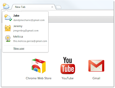
In today's Beta release, we've added a new feature that lets people who use a shared computer each have their own personalized Chrome, and lets them each sign in to Chrome to sync their stuff.


To try it out, go to Options (Preferences on Mac), click Personal Stuff, and click "Add new user." A fresh instance of Chrome will open, ready to be customized with its own set of apps, bookmarks, extensions, and other settings. A badge in the upper corner lets you know at a glance that this new Chrome browser belongs to you, and you can customize the name and badge as you like. Clicking this badge drops down a menu of all the users on that computer, so you can easily switch between them. In addition, each user can sign in to Chrome to access their own personalized Chrome across all their computers.

One thing to keep in mind is that this feature isn't intended to secure your data against other people using your computer, since all it takes is a couple of clicks to switch between users. We want to provide this functionality as a quick and simple user interface convenience for people who are already sharing Chrome on the same computer today. To truly protect your data from being seen by others, please use the built-in user accounts in your operating system of choice.


Recent Posts: Chrome / Google Blog

Wednesday, November 2, 2011


Wow Its Gmail. Have you tried this?

Streamlined conversations
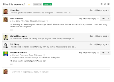
Conversation view has been completely redesigned to help you read through your email threads. You'll now see profiles pictures for your contacts, so it's easier to keep track of who said what. We also stripped out as much as possible so you can focus on communicating with your friends and colleagues.


Elastic density
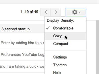
We know that you use Gmail from a variety of screen sizes and devices, so now the spacing between elements on the screen will automatically change based on the kind of display you're using. If you prefer a denser view all the time, you can change your density manually in the Settings menu.


New HD themes
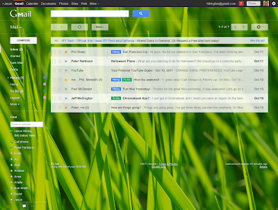
Themes have been completely rebuilt to enable us to bring you a new set of beautiful high resolution themes with imagery provided by iStockphoto. We've updated most of the old favorites as well and your theme will be automatically carried over to the new look. Go to the Settings menu to take another look at themes and choose the one that fits you best. 


Smarter navigation
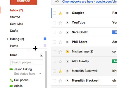
The navigation panel on the left keeps your labels and chat contacts in view at all times. It's also more customizable: you can resize the labels and chat areas if you want to see more, or hide the chat area entirely via the chat icon in the lower left. You can also use the arrow keys to navigate around the interface.


Better search
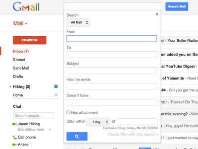
Click the dropdown in the search box to see a new advanced search panel, which makes it easier and faster to find exactly what you're looking for. You can use the same panel to create a filter from any search in just a few clicks.


We're excited to finally share Gmail's new look with you. We'll be bringing these changes to everyone soon, but if you'd like to make the switch right away, we're rolling out a Switch to the new look link in the bottom-right of Gmail over the next few days.

Note: The new look is now available to everyone. Refresh Gmail if you don't see the link to switch.

Wednesday, October 19, 2011


Introducing Galaxy Nexus. Simple, beautiful, beyond smart


Description: Galaxy Nexus is the next generation of Nexus devices co-developed by Samsung and Google. Nexus combines innovative hardware with the newest version of Android, 4.0, Ice Cream Sandwich, and the latest Google mobile services.

Video Link: http://www.youtube.com/watch?feature=player_profilepage&v=-F_ke3rxopc

Friday, October 14, 2011


Taste of Ice Cream Sandwich [Video]

Wednesday, September 28, 2011


Have you noticed the the new look of gmail blog - New Dynamic Views from Blogger

Even Blogger templates?

Yes, Official Gmail blog also goes with google+ theme (the same white and grey color)
Have are some screenshots of the new dynamic views from official gmail blog.


Blogger Dynamic Views [video]


comment here what do you feel!

Tuesday, September 27, 2011


A New "New Tab" page on Google Chrome

Google redesigned the page to simplify the visual appearance and make it easier to manage your apps, bookmarks, and most visited sites, so you can get where you're going as quickly as possible.

Your apps, bookmarks, and most visited sites now appear in three different sections on the page. You can flip between these different sections by clicking the section labels at the bottom of the page or the arrows at the side of the page. Chrome will remember the last section you flipped to and return to it when you open a new tab.
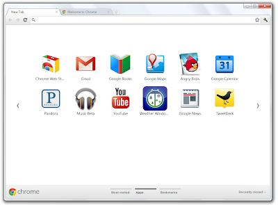

Here are a few more tips for using the new New Tab page:

  • To rearrange apps, just drag and drop them on the page.
  • To create a new apps section, drag an app to the bottom of the page until a new apps section appears. You can rename this section by double-clicking the label. For example, you can create a section of apps for "Work" (full of productivity apps) and a section for "Play" (full of games).
  • To remove items from any section on the page, start dragging them to the bottom right of the page. A trash can will appear, where you can drop the item to remove it.
  • To see the tabs you've just closed, click "Recently closed" on the bottom right of the page.

Thursday, September 22, 2011


Login Multiple Gmail in your Mobile

Originally posted by Dominic Leung, Mobile Software Engineer (from gmail blog)


The Gmail for mobile team works hard to bring you features that make you more productive on the go. Today, we will highlight some new features for Gmail in your mobile browser.

Multiple sign-in support

Just like on your desktop, you can now to sign into multiple accounts simultaneously. To sign into an additional account, click on the account switcher at the bottom of the threadlist, then click "Sign into an another account." You can quickly switch between accounts by selecting the desired account from the Accounts menu.


Mobile-specific signature

We know that autocorrect and other mobile spell-checks can be frustrating as you are typing on the go. Let your friends know that you are responding via your mobile phone so that they understand why you might have sent a message that you are meeting for "monitors" and not "mojitos". It's an easy way to make them understand why your message might be short or have a few typos. To create a mobile signature, from the menu view, press the new settings icon, choose your signature, and then check the box that tells us you want to activate it. If you ever want to disable the mobile signature, you can uncheck the box and we will use your desktop signature instead.


Vacation Auto-Responder

Ever forgotten to set your out-of-office auto-reply in Gmail before going on a trip? You don't have to worry about that anymore, since you can now set your auto-reply using the mobile interface. Simply choose a start and end date and specify your message, just like on the desktop interface.


As part of added multiple sign-in support, we've updated URLs so that each account can have a separate bookmark. For those who have previously bookmarked Gmail for Mobile, please update your bookmark. If you haven't, now is a great time to head to mail.google.com on your smartphone or tablet browser and add a bookmark to your home screen.

Wednesday, September 21, 2011


Google+ is now OPEN TO ALL and More..

Originally posted by Vic Gundotra, Senior Vice President of Engineering & Punit Soni, Google+ Mobile PM 

The Google+ project has been in field trial for just under 90 days, and in that time we've made 91 different improvements (many of which are posted here). Google+ is still in its infancy, of course, but we're more excited than ever to bring the nuance and richness of real-life sharing to software. Today we're releasing nine more features that get us that much closer.

+Hangouts: more places, more people, more to do

Hangouts uses live video to bring people together, face-to-face-to-face. And from day one, the community has shaped and stretched the feature in amazing ways—from cooking classes togame shows to music concerts. We're determined to keep this momentum going, and to keep providing new ways to communicate in-person, so we hope you enjoy this week's round of Hangouts improvements.

Hangouts on your phone
In life we connect with others in all sorts of places, at all different times. And the connections you make unexpectedly are often the ones you remember the most. We think Hangouts should keep pace with how you socialize in the real-world, so today we're launching it on the one device that's always by your side: your mobile phone. To get started, simply find an active hangout in the Stream, and tap "Join":

Hangouts on your phone: Stream View (left), Green Room (center), Portrait Mode (right)

Hangouts currently supports Android 2.3+ devices with front-facing cameras (and iOS support is coming soon). The new mobile app is rolling out to Android Market today, so you can start hanging out at any time, from just about anywhere.

Hangouts On Air
Google+ users already use Hangouts to create intimate onscreen experiences—with family membersprayer groups, even people with certain medical conditions. But sometimes you want to speak to a large audience, or alternatively, view as a spectator. In these cases a public broadcast is what's needed, so today we're introducing Hangouts On Air.

The setup is simple enough: just start a normal hangout, and you'll have the option to broadcast and record your session. Once you're "On Air," up to nine others can join your hangout (as usual), and anyone can watch your live broadcast:


Hangouts On Air: Stream View (left), Full-screen Mode (right)

We're starting with a limited number of broadcasters, but any member of the Google+ community can tune in. In fact: we'll be hosting our very first On Air hangout with will.i.am on Wednesday night, September 21. For more information visit will.i.am's or my profile on Google+.

Hangouts with extras
Spending time together goes hand in hand with actually doing things together. Dinner with family can easily turn into movie night at the local theater, for instance. And running into old friends can inspire anything from photo sharing to vacation planning. Hangouts has always included a basic set of in-room actions (like group chat and co-viewing of YouTube videos), but we want to make it easier to do a lot more. That's why we're previewing some extras, including:
  • Screensharing: for when you want to show off your vacation photos, your high score, your lesson plan or whatever else is on your screen
  • Sketchpad: for when you want to draw, doodle, or just scribble together
  • Google Docs: for when you want to write, plan or present something with others
  • Named Hangouts: for when you want to join or create a public hangout about a certain topic (like fashion or music or sports...) 
Hangouts with extras: Screensharing (left), Sketchpad (right)

Hangouts with extras: Docs (left), Named Hangouts (right)

The extras are still under construction, but we wanted to preview these features and get your feedback sooner versus later. So start a hangout, click "Try Hangouts with extras" in the green room, and let us know what you think.

Hangouts APIs
If field trial has taught us anything about Hangouts, it's that the community is overflowing with creative individuals. So in the wake of last week's Google+ API launch, we're also releasing a basic set of Hangouts APIs. If you're a developer who wants to build new kinds of apps and games (and who-knows-what-else), then you can find more details on the Google+ platform blog.

+Search: find the people and posts you care about

Search in Google+
You've been asking for it, and we've been busy building it, so today we're bringing Google's search expertise to Google+. Just type what you're looking for into the Google+ search box, and we'll return relevant people and posts, as well as popular content from around the web.

If you're into photography, for example, then you'll see other enthusiasts and lots of great pictures. If you care more about cooking, then you'll see other chefs and food from around the globe. In all cases, Google+ search results include items that only you can see, so family updates are just as easy to find as international news.

Search in Google+: photography (left), cooking (right)

With more than 1 billion items shared and received every day, we're excited to see how search will connect people through their posts on Google+.

+Everyone

100. Anyone can sign up for Google+—no invitation required.
For the past 12 weeks we've been in field trial, and during that time we've listened and learned a great deal. We're nowhere near done, but with the improvements we've made so far we're ready to move from field trial to beta, and introduce our 100th feature: open signups. This way anyone can visit google.com/+, join the project and connect with the people they care about.

You asked for it 


We take your feedback very seriously, and we do our best to deliver your most-requested features as quickly as possible. So today we're launching three more things you've been asking for in Google+ mobile:


  • Improved SMS support. Users in the US and India can now post to Google+, receive notifications, and respond to group messages via SMS (with more countries on the way). To start texting, just verify your phone number in Google+ settings. 
  • Improved +mentions support. To add someone in your circles to a conversation (or simply get their attention), you can now +[their name] inside a post or comment. 
  • +1'ing comments. When you read a great comment in the Stream, you can now +1 it directly from your iOS device (with Android coming soon). 
    SMS (left), +mentions (center), +1'ing comments (right)

Giving you more choices 

The most important part of Google+ is you, so we want to make sure you have meaningful ways to personalize your experience -- from selecting just the right people to share with, to switching between the app, the web, and SMS as you see fit. Today we're excited to bring three new options to mobile users:
  • Edit your profile photo. You can now put your best face forward, from where you happen to be. Just visit your profile, click edit, and you can choose or take a new picture. 
  • Customize your notifications. Some notifications may be more important than others, especially when you're on the go. Now you can decide which ones you see (or not) on your phone. 
  • Make some room. If you're taking lots of photos, or installing lots of apps, then internal storage can sometimes shrink. That's why you can now move the Google+ app to SD storage on Android devices. 
 Edit your profile photo (left), Notification settings (center), Move to USB (right) 


So long Huddle, hello Messenger (and hi there, photos) 

As we move from limited field trial to open beta, we're renaming Huddle to Messenger. More importantly, we're adding new functionality to Messenger that makes group communication even more fun: photo sharing. So now when you're sitting down for a meal, or kicking back on vacation, you can show your circles what's happening, right this second:


Messenger: Homescreen (left), Choosing a Photo (center), Posting a Photo (right)  

We hope you enjoy today's round of Google+ mobile features. There's plenty left for us to do, so we'll keep listening, and working to make your mobile experience that much better. In the meantime, you can try the new app (on Android and the mobile web today, and on iOS soon), and let us know what you think.


Source:

Tuesday, September 20, 2011


Introducing Google Wallet - Working with Visa, American Express and Discover

Originally posted by Osama Bedier (Vice President of Payments) in google mobile blog

Google Wallet enables you to pay with your Citi MasterCard credit card and the Google Prepaid Card, which can be funded with any of your existing plastic credit cards. As a thanks to early adopters, we’re adding a $10 free bonus to the Google Prepaid Card if you set it up in Google Wallet before the end of the year.

When we announced Google Wallet, we pledged a commitment to an open commerce ecosystem. We appreciate Citi and MasterCard for being our launch partners. And today, Visa, Discover and American Express have made available their NFC specifications that could enable their cards to be added to future versions of Google Wallet.

Our goal is to make it possible for you to add all of your payment cards to Google Wallet, so you can say goodbye to even the biggest traditional wallets. In fact, we’ve got a video of our first customer, someone who is ready to replace his famously over-stuffed wallet. We hope Google Wallet gives him “serenity now.”

This is still just the beginning and while we’re excited about this first step, we look forward to bringing Google Wallet to more phones in the future. You can learn more about Google Wallet at google.com/wallet.

Sunday, September 18, 2011


Google Unveils Flight Search [video]


Description: Flight search is a feature that helps you explore air travel options for a number of cities, and plan your trip with just a few clicks of the mouse.

Google Flight: 
http://www.google.com/flights/

Video Link: http://www.youtube.com/watch?v=OC2bUYVkjrY

Thursday, September 15, 2011


Add +1 button in Google Sites

Posted by Michael Verrilli, Software Engineer (from google docs blog)

We have been thrilled with the response to the launch of the +1 button on websites all across the web, but we also heard that you'd like a simple way to add the +1 button to your own Google Sites. Adding the +1 button to your site will allow your visitors to recommend it to their friends and contacts, which helps more people discover it via their personalized search results


Starting today, you can add the +1 button to any individual page by choosing +1 Button from theInsert menu, or you can add it to your site's sidebar and have it appear on every page instantly by editing your Site Layout under Manage Site


Update: Improved accessibility for Google Calendar

Posted by Florian Niemann, Software Engineer (from official gmail blog)


Today we announced some of the updates we've released recently to make Google's applications more accessible to the blind community. Google Calendar now has new keyboard shortcuts and better screen reader support for our blind users. Members of the blind community can now useJAWSVoiceOver and ChromeVox to manage your calendars, create and edit events or simply browse your events. Here are a few examples of how screen readers and keyboard shortcuts work with Google Calendar: 

  • In your calendar lists, you can use the up and down arrow keys to navigate between your calendars. For each calendar in the list, you'll hear its name and can use the spacebar to turn the calendar on or off. To remove a calendar from the list, use the delete key.
  • In the agenda view, you can use the up and down arrow keys to move between events and use the left and right arrow keys to move between dates. To expand an event and expose the event details, press enter. To go to the event details page, type 'e'. To remove an event, press delete. Although agenda view provides the best screen reader experience today, we are also working on improved accessibility for other views.
  • In the guest list on the create/edit event page, you can navigate around using the up and down arrow keys. Use the spacebar to switch a guest's status between optional and required. To remove a guest from the list, use the delete key.
  • Additional keyboard shortcuts make it easier to use Google Calendar no matter which view or screen you're on. Type 'c' to create an event, '/' to start a search, and '+' to add a calendar.
For a complete list of keyboard shortcuts and to learn more about using Google Calendar with screen readers, please visit the help center. With these new accessibility features, we hope to make it easier for everyone to use Google Calendar. Please use this form to share your feedback directly with the accessibility team so we can continue to improve our products.