Original post by Luciano Cheng, Software Engineer (from enterprise blog)
As the dramatic growth of the mobile web changes the way people consume content, it's becoming increasingly important for publishers to provide a good mobile experience. With this in mind, we just added automatic mobile rendering in Google Sites for iOS 3.0+ and Android 2.2+ devices, and a mobile version of the Google Sites lists.
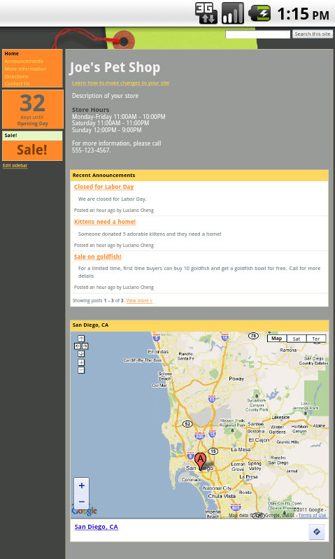
By going to General settings under More actions > Manage site and clicking on Automatically adjust site for mobile phones, your Google site will be automatically adjusted whenever it's viewed from an iOS or Android 2.2+ device:
 |  |
| Before | After |
The most noticeable automatic adjustments include:
- Aligning the header layout and top bar
- Fitting the width of the site to match the device's width
- Smart handling of sidebars, horizontal navigation, and dropdown links
After you've enabled this feature, you can preview the page from your computer as a mobile viewer using More actions > Preview as viewer (Mobile).
You can also choose to hide some of the links in your site's footer to save vertical space.

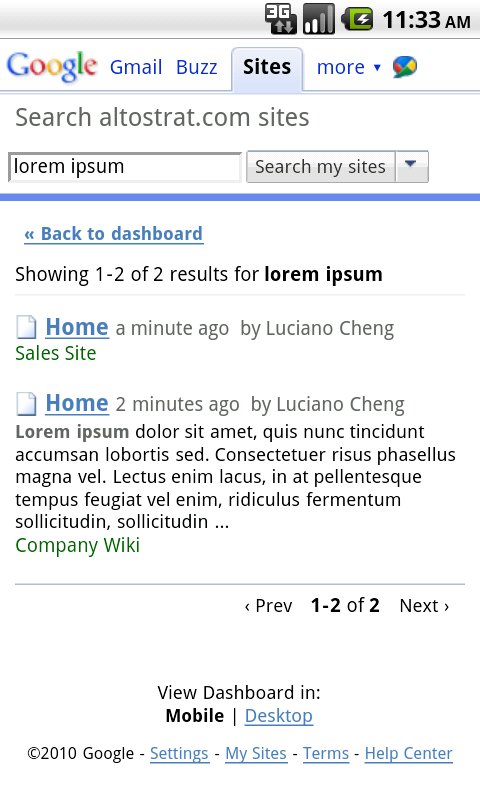
It's also important for you to be able to access and search your own sites on the go, which is why we've also added mobile versions of the site list, sites search, and browse sites categories.


Just navigate to http://sites.google.com from any iOS 3.0+ or Android 2.2+ device for quick access to your sites.
As more people unplug from their desks and interact with content on the go, new doors are opening for everyone. We hope these tools will empower you to meet the challenges of publishing in a mobile world using Google Sites.


